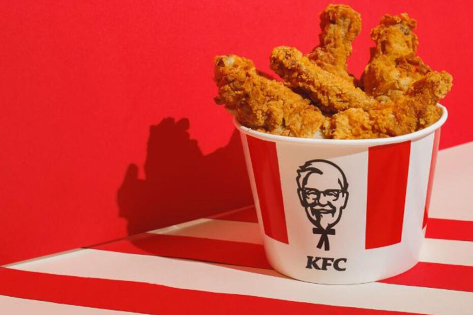
What happens when you notice that a KFC bucket kind of resembles an F1 track chicane? If you’re KFC Canada (and your agency is Courage Inc.), you spin that tiny visual overlap into a national OOH sensation that thrills both racing fans and marketers.
Dubbed #KFChicanes, the campaign cleverly connects two high-speed icons: Formula 1 racing and fast food. With a stroke of visual genius and perfectly-timed placement, KFC created a buzzworthy activation that proves you don’t need to scream to be heard—you just need a clever hook.
Here’s the full breakdown of the campaign—from strategy to visuals—and the 10 biggest lessons brands can steal today.

1. The Insight That Sparked It All
KFC’s buckets have long featured red and white stripes. So do F1 curbs—the tightly curved, striped sections drivers zig-zag through during a chicane.
That tiny visual connection was all it took for Courage Inc. to ask:
“Do KFC buckets kind of look like chicanes?”
Turns out—yes, they do. So well, in fact, that once you notice it, it’s all you’ll see. That’s the magic of the KFChicanes concept.

2. Campaign Concept: The Minimalist Masterstroke
Instead of launching a full-throttle campaign filled with banners, mascots, or race cars, KFC went minimal.
What They Did:
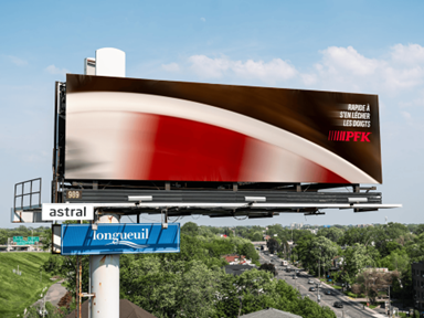
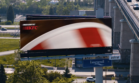
- Swapped F1 track curves with blurred KFC buckets to mirror famous chicanes (Senna Curve, Wall of Champions).
- Used real-world F1 race locations like Circuit Gilles-Villeneuve to ground the visuals.
- Adopted a tongue-in-cheek tagline: “Finger Lickin’ Fast.”
No loud slogans, no clutter—just a strong visual pun elevated to art.

3. Execution: Out-of-Home That Hit the Fast Lane
The campaign dropped around the Canadian Grand Prix—prime time for motorsport fans.
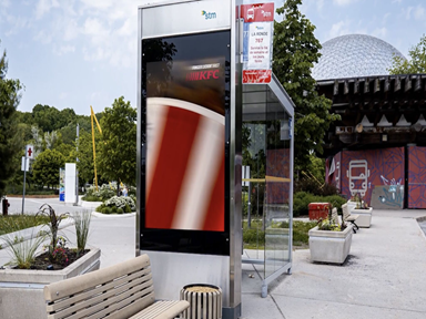
OOH Placements:
- Strategic billboards across Montreal, especially near F1 hotspots.
- Posters and print ads with just enough branding to tease.
- Social media rollout via Mad Over Marketing, LinkedIn creatives, and Twitter buzz.
The best part? It wasn’t about F1—it felt like F1.


4. The Tagline Pivot: From Good to Fast
KFC has long claimed to be “Finger Lickin’ Good.” But what better moment to tweak it than the Grand Prix?
So, for this campaign, it became:
Finger Lickin’ Fast.
It’s simple, snappy, and stays rooted in brand identity—while aligning perfectly with racing’s high-speed energy.

5. The Visual Payoff: Seeing Is Believing
You don’t need to read a sentence of copy to understand what KFChicanes is doing. The visuals do the work:
- A KFC bucket blurred along the curve of a race track
- The exact same red and white stripes
- A camera angle straight from race-day footage
It’s smart. It’s satisfying. It sticks.

6. Cultural Timing + Placement: A Perfect Overtake
Launching around the Formula 1 Canadian GP wasn’t just convenient—it was calculated. The entire city of Montreal was in racing mode.
By placing the campaign directly within viewer context, KFC wasn’t interrupting—they were joining the moment.
That’s why the campaign didn’t feel like an ad. It felt like part of the race-day experience.
7. Brand Personality: Quirky, Smart, Fast
This campaign worked because it:
- Played on visual humor
- Showed KFC isn’t afraid to poke fun
- Reinforced KFC’s connection to speed (fast food)
It also leaned heavily on visual intelligence—not punchlines or celebrity endorsements. The result? A campaign that felt smart and self-aware.

8. Lessons for Marketers
Here’s what other brands—big or small—can take away from KFChicanes:
Spot Hidden Similarities
Sometimes your logo, packaging, or tagline may resemble something culturally iconic. That’s a creative doorway.
Lean on Visual Wit
Humor doesn’t always need a punchline. A simple visual parallel can pack a punch.
Context Is Queen
The campaign’s success relied on where it appeared. Knowing your moment matters as much as the message.
Edit Ruthlessly
Minimal design. No clutter. No long copy. And yet? Maximum recall.
9. FAQs About KFChicanes
Q1: Was this campaign global or local?
It launched in Canada but gained global attention thanks to LinkedIn virality and Twitter buzz.
Q2: Who created KFChicanes?
Creative agency Courage Inc., recently expanded in Montreal, led the concept and execution.
Q3: Did KFC run this during an actual race?
Yes! It coincided with the 2025 Canadian Grand Prix—timing that made the visuals even more relevant.
Q4: Were these actually “chicanes”?
Technically, no. Some racing fans argued they were curbs, not chicanes. But for branding? Close enough!
Q5: What other brands have used similar tactics?
Brands like McDonald’s (with golden arches as street lamps) and Spotify (data-themed OOH) use context+creativity similarly.
Q6: Will we see more from Courage Inc. + KFC?
Most likely! This campaign marks the start of more bold-but-simple brand activations from the team.
10. Campaign Stats + Summary Table
| Metric | Value |
| Agency | Courage Inc. |
| Launch Region | Canada (Montreal focus) |
| Event | 2025 Canadian Grand Prix |
| Visual Concept | KFC bucket = F1 chicane |
| Tagline Used | Finger Lickin’ Fast |
| Format | OOH, print, social |
| Result | High engagement, viral buzz, media praise |

Conclusion: A Fast, Funny, Finger-Lickin’ Win
KFC’s “KFChicanes” campaign wasn’t loud, long, or expensive. It was observant, clever, and timed to perfection. It proves that the right creative spark—combined with strong design instincts—can make any brand part of the cultural moment.
No celebrity partnerships. No promo codes. No QR gimmicks.
Just a bucket. A curve. A laugh.
And maybe a little hunger.