Canva’s Billboard Campaign at Waterloo Station: A Masterclass in Creative Advertising
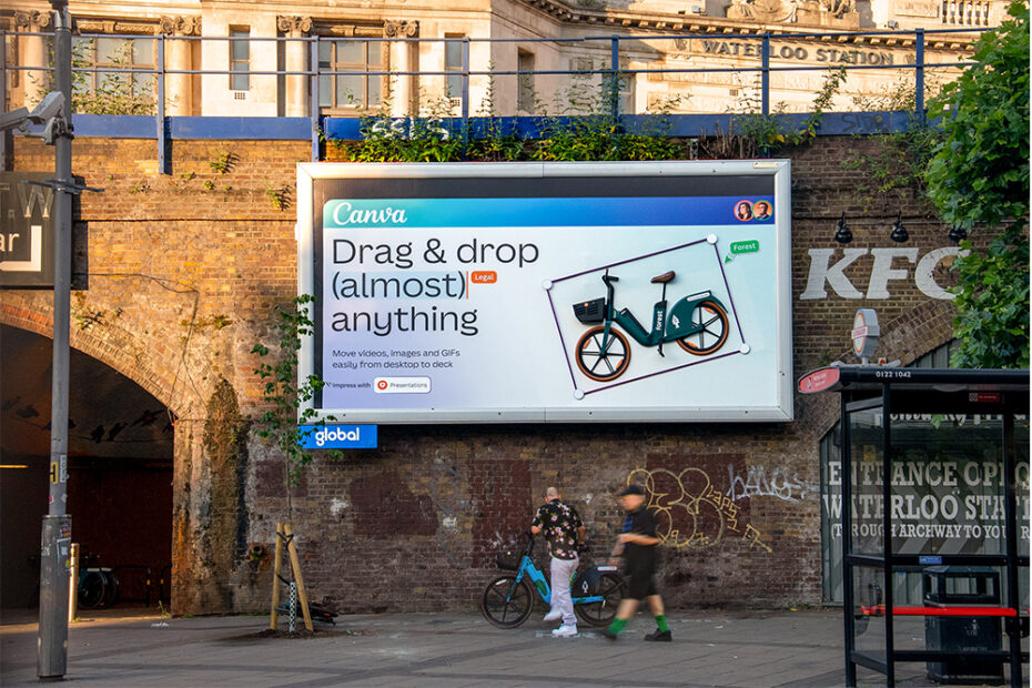
Out-of-home (OOH) advertising is getting smarter, sassier, and far more relatable—and Canva’s latest campaign at London’s Waterloo Station proves just that. The ad doesn’t shout for attention with polished perfection; instead, it turns a design cliché into a moment of pure creative brilliance.
“Make the logo bigger.”
It’s a phrase every designer has heard—sometimes jokingly, often frustratingly. But Canva, with its finger on the pulse of the global design community, decided to blow that directive out of proportion—quite literally. http://For more on creative campaigns, check out our article on Zepto’s innovative outdoor ad.

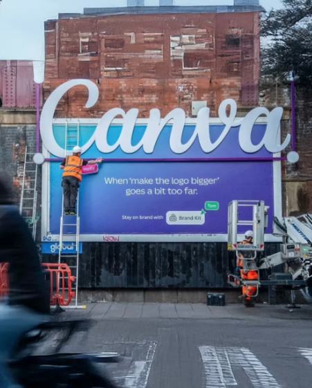
The Visual Joke: When the Logo Actually Goes Too Big
The ad showcases a giant “Canva” logo breaking out of the billboard frame itself, while the text below reads:
“When ‘make the logo bigger’ goes a bit too far.”
It’s part visual pun, part industry inside joke, and 100% relatable to the thousands of designers, brand managers, and creatives who walk past it daily. Not only does it spark a laugh—it also spotlights Canva’s Brand Kit tool, subtly reinforcing that Canva helps keep branding consistent without going overboard. http://<p>For more insights into creative advertising, check out our <a href=”/zepto-innovative-outdoor-ad”>analysis of Zepto’s innovative outdoor advertising strategy</a>.</p>
This ad was designed not just to grab attention, but to speak directly to its core audience: creative professionals. In doing so, Canva accomplished something many brands struggle with—authentic connection.

Why This Ad Works So Well
1. It Understands Its Audience
Instead of broadcasting a generic marketing message, Canva tapped into a shared experience among designers: client feedback that often lacks context but demands major changes. “Make the logo bigger” is a common punchline in design circles, and Canva took the joke offline—turning it into a literal display.
2. It’s Visually Disruptive
OOH ads need to grab attention quickly. By breaking the billboard frame and blending physical installation with design, Canva creates a multi-dimensional experience that makes commuters stop, stare, and snap photos.
3. It Builds Brand Trust through Humor
Canva isn’t laughing at clients or designers—it’s laughing with them. The tone is playful, not mocking. This builds brand affinity and trust because Canva comes across as a platform made by creatives, for creatives.
4. Subtle CTA with “Brand Kit”
While the humor takes center stage, the message still lands: use Canva’s Brand Kit to stay on-brand. The ad doesn’t need hard sells—it simply reminds designers that Canva understands their pain points and has tools to fix them.

Lessons for Marketers and Advertisers
Canva’s campaign offers a handful of valuable takeaways for marketers and creatives alike:
✅ Speak the language of your audience
You don’t have to over-explain. The best advertising often relies on shared context. Canva knew that designers would immediately get the joke—no extra copy required.
✅ Don’t be afraid to poke fun at industry clichés
When done tastefully, self-awareness can be incredibly powerful. Humor humanizes brands, and audiences appreciate the vulnerability and relatability it brings.
✅ Design is more than digital
Canva extended its brand personality from screens to the physical world. OOH advertising, especially when done creatively, gives a digital-first brand real-world credibility.
✅ Keep it on-brand
Despite being a punchline, the ad never strays from Canva’s clean, friendly, and helpful tone. The palette, typography, and voice remain distinctly “Canva.”

Behind the Campaign: From Pixels to Pavement
While we don’t have all the internal details of the campaign execution, it’s safe to say Canva collaborated with a seasoned OOH media and production team. The engineering behind a logo bursting out of a billboard isn’t simple—and it’s likely the brand worked closely with experiential marketers and structural designers to bring this vision to life.
This campaign proves that even the most digital-native brands can benefit from creative, real-world activations. In fact, it shows how powerful hybrid strategies (digital x physical) can become when built around a strong insight.

The Future of Out-of-Home Ads
OOH is evolving rapidly. No longer just static posters, today’s billboards are:
- Interactive – some use AR/VR or motion sensors
- Experiential – like this Canva piece that physically breaks boundaries
- Sharable – made with viral design in mind
The goal of modern OOH isn’t just to inform—it’s to provoke. Whether that’s laughter, curiosity, or a sense of belonging, emotional responses lead to stronger brand impressions.

Canva’s Role in Democratizing Design
Behind all the cleverness is a company that’s quietly revolutionizing the design world. Canva’s tools simplify complex workflows, allowing small businesses, educators, and nonprofits to create stunning visuals without formal design training. Their campaign mirrors that mission:
- It’s clear.
- It’s accessible.
- It’s beautiful and fun.
And most importantly—it proves that great design communicates without explanation.

Final Thoughts: A New Standard for OOH Campaigns
This Waterloo Station installation is more than just another billboard—it’s a masterclass in empathy-based marketing. Canva saw a pain point, turned it into a punchline, and in doing so, created an unforgettable brand moment.
As other companies consider venturing into OOH spaces, there’s a valuable lesson here:
Don’t just advertise. Converse.
Don’t just promote. Connect.
Don’t just instruct. Inspire.
And if all else fails—try making the logo bigger.